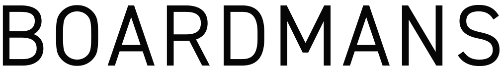
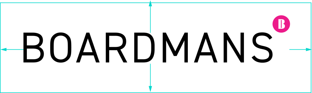
Logotype
Based on DIN 2014 Regular but slightly increased in weight, the logotype element of our visual identity presents a fresh, timelessly modern and intelligent feel. Open spacing and beautiful visual balance with a recognisable contour makes it memorable without being ‘loud’.
Our logotype element has been spaced accurately and precisely around what we term ‘open setting’, that is where the letterforms are spaced beyond ‘tight’ and ‘normal’ but not so extreme as to be too obviously separated (*see don’ts). The spacing works visually at any size retaining all of its positive qualities.
Restrictions
We need people to instantly identify our logotype. It’s our mark of authenticity. There are some things you must never do nor allow to be done to our logotype. The best rule is only use the logotypes provided in the Brand Assets Library.
Never respace the letters
Never use weights of DIN 2014 other than DIN 2014 Regular
Never use a font other than DIN 2014 (unless in running copy see next/previous page)
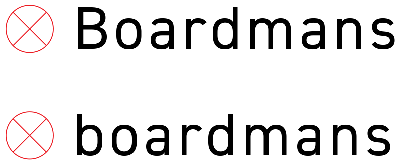
Never set our logotype with initial caps or all in lowercase
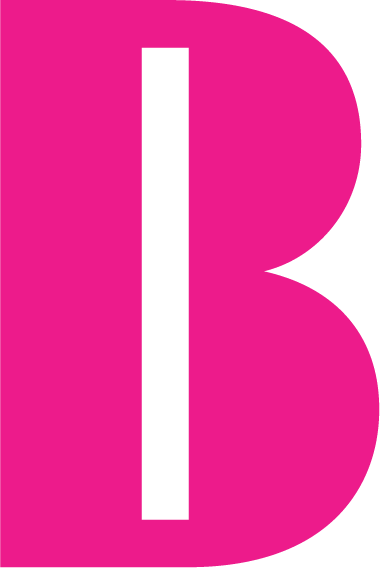
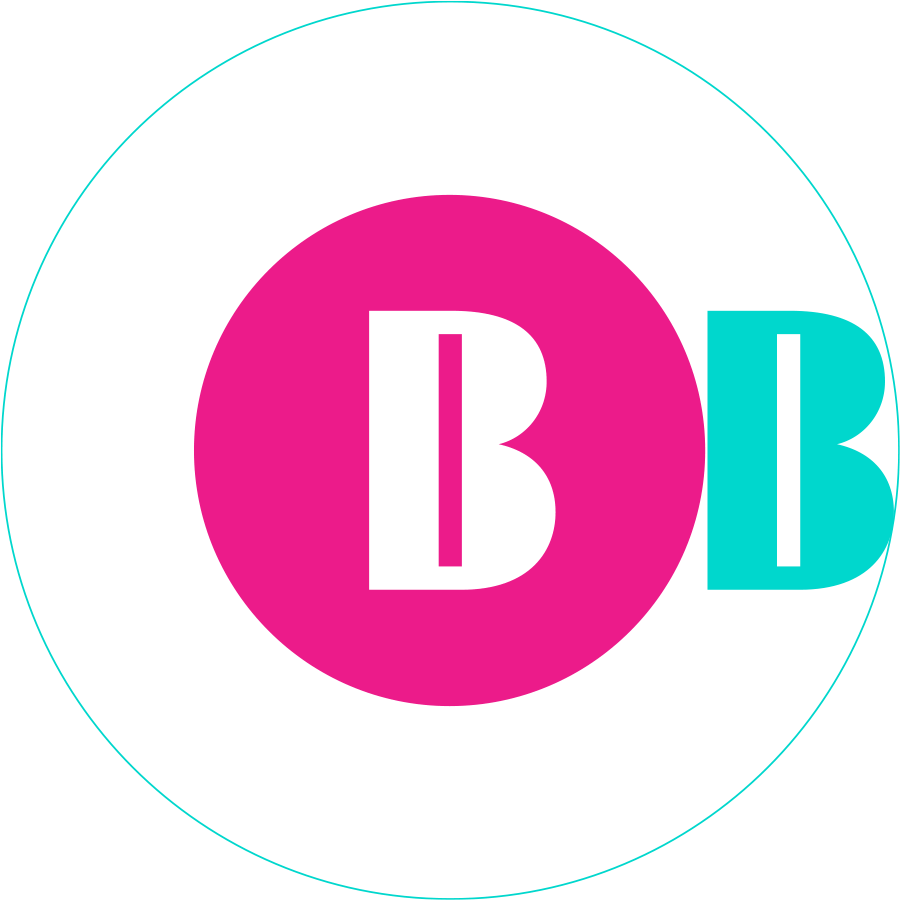
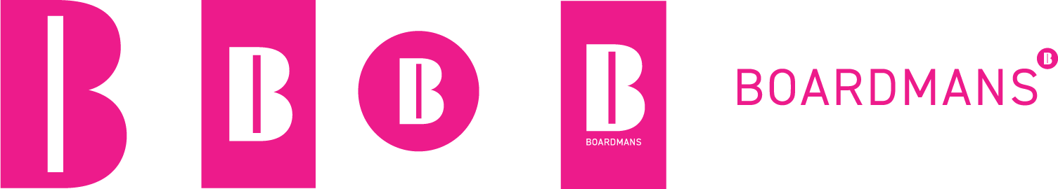
Device
Is the single most important element of our identity system. It clearly represents us with its bold and unequivocal presence.
We are BOARDMANS with a BIG B.
Primary device
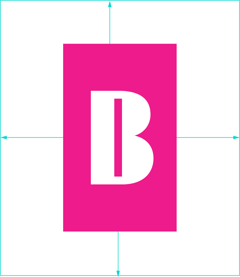
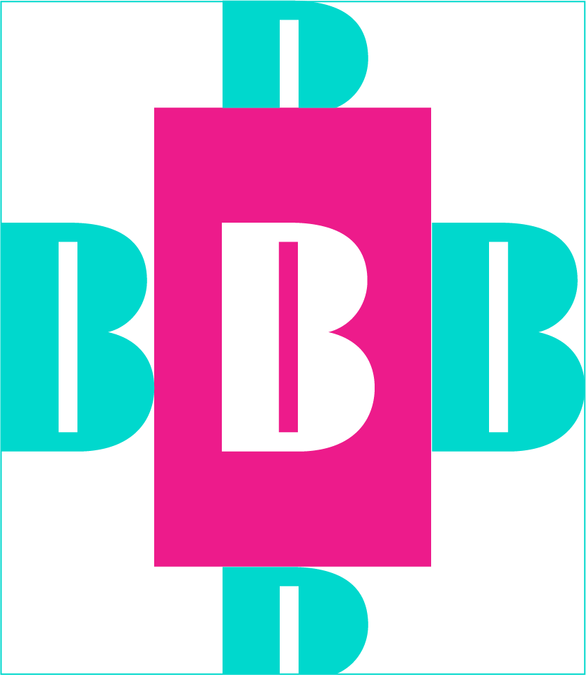
Rectangle device
Roundel

Rectangle stack
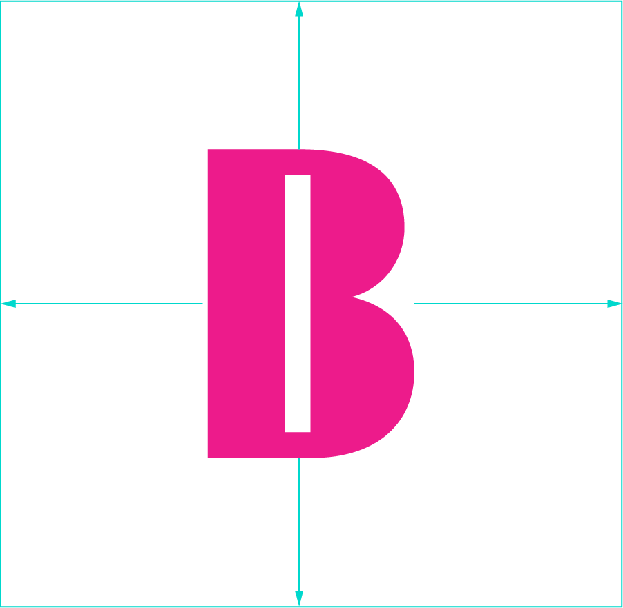
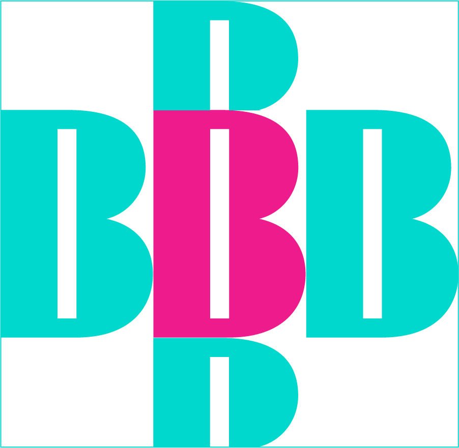
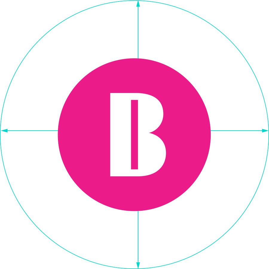
Safe Zone
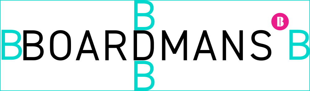
Each device has a safe zone around it. The safe zone is the closest we permit any other item on a page. For simplicity, the primary device safe zone can be calculated using its width horizontally and half of its height vertically.
Always make the calculations with the ‘B’ in proportion to the device so that you always have the safe zone realtive to its size. The safe zone always extends to left and right and above and below.
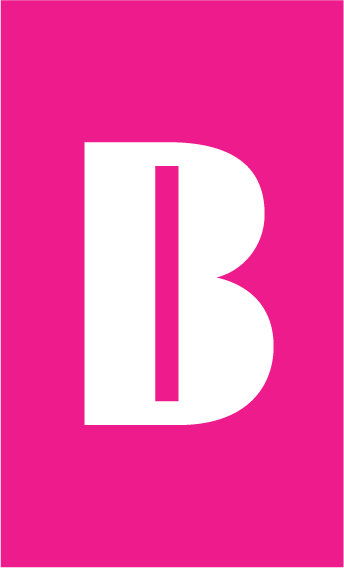
Usage
Primary device use against backgrounds.
DO Use the Primary device on top of solid colours - pink wherever possible
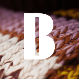
DO Use the Primary device on top of photographs

DO Use the Primary Device on top of gradients
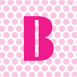
DO Use the Primary Device on top of background patterns.
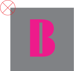
DON’T Use pink against the same or similar tonal background
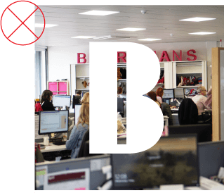
DON’T Use the Primary device on top of photographs when it makes the device difficult to see.

DON’T Use the Primary Device on top of gradients when it makes the device difficult to see.
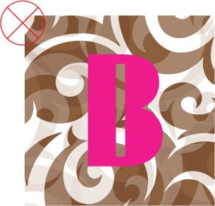
DON’T Use the Primary Device against patterns that make the device difficult to see.
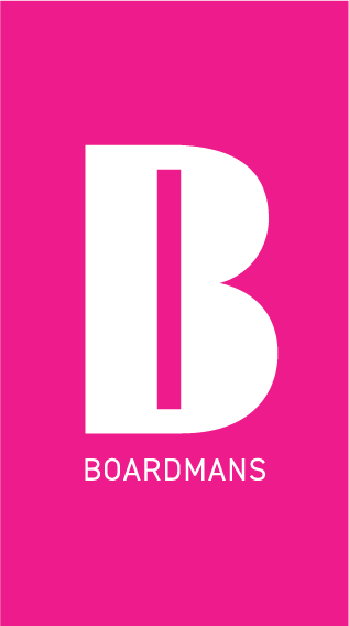
Logotype Stack
Where the logotype leads the device we refer to this as the Logotype Stack.
The logotype and roundel device have been carefully composed.

Safe Zone
Each device has a safe zone around it. The safe zone is the closest we permit any other item on a page. For simplicity, the primary device safe zone can be calculated using its width horizontally and half of its height vertically.
Always make the calculations with the ‘B’ in proportion to the device so that you always have the safe zone realtive to its size. The safe zone always extends to left and right and above and below.
Colour
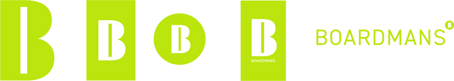
When you are restricted to one colour use our primary pink 1 or black 2.
If the device is used by a third party and they are using only one colour ensure the whole device and log is in the same solid colour.

Restrictions
We need people to instantly identify our logotype. It’s our mark of authenticity. There are some things you must never do nor allow to be done to our logotype. The best rule is only use the logotypes provided in the Brand Assets Library.
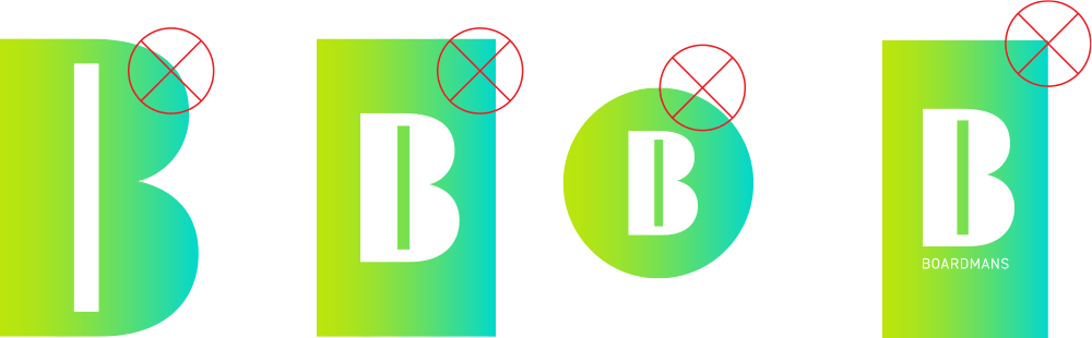
Never use gradients in our devices
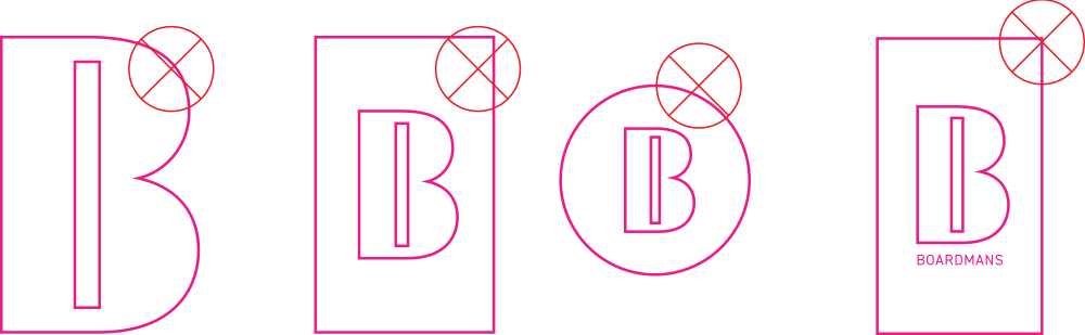
Never use an outline
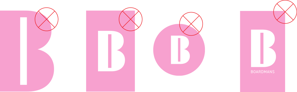
Never use a tint always a solid
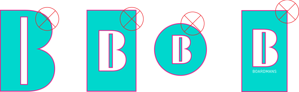
Never use colour combinations
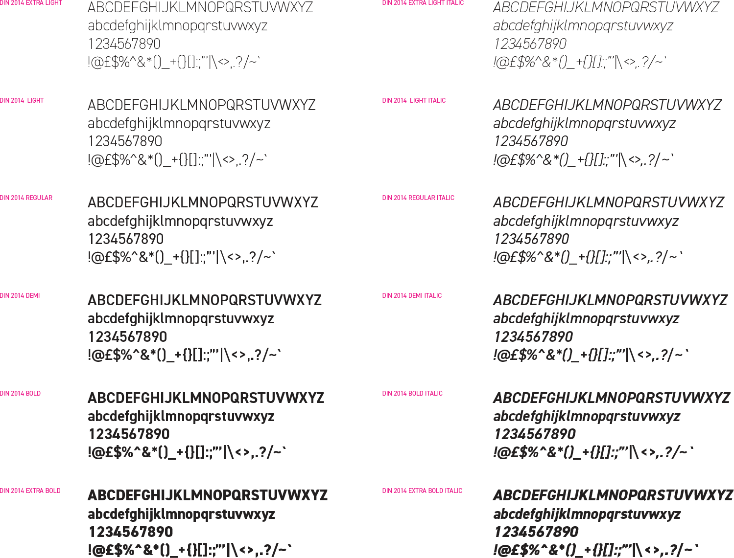
Fonts & Type
Boardmans uses DIN 2014 as it’s go to font family.
DIN 2014 is fresh, clean, classically modern. It is easy to read. In so far as a typeface can look intelligent then DIN looks intelligent.
DIN 2014 is a web font.
DIN 2014 font family
DIN 2014 has a wide choice of weights and widths. It will never get boring.
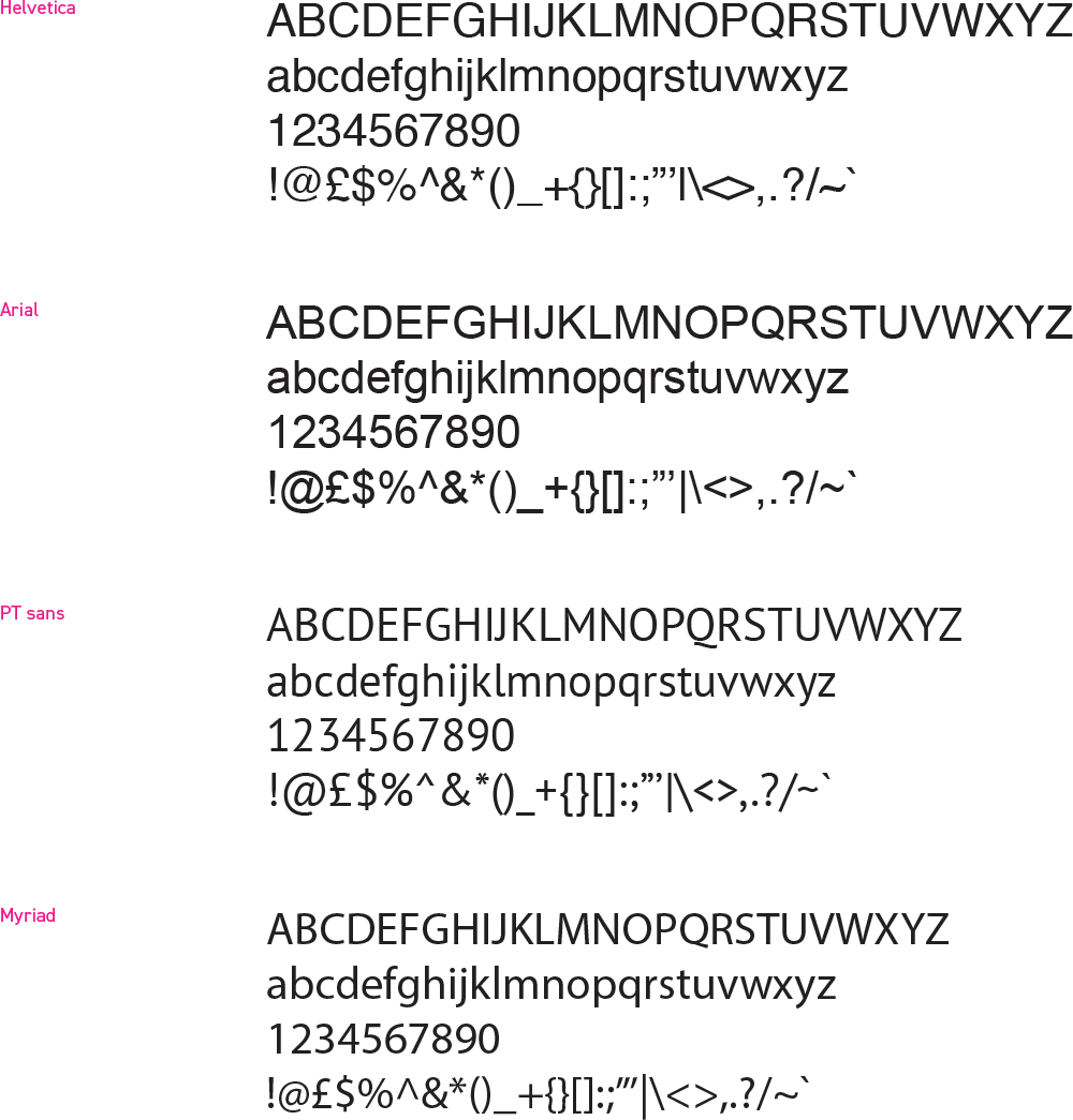
Alternative fonts
Where DIN 2014 isn’t available we turn to other commonly available sans serif fonts in order of preference from top to bottom. Always use DIN 2014 where available.
Restrictions
We need people to instantly identify our logotype. It’s our mark of authenticity. There are some things you must never do nor allow to be done to our logotype. The best rule is only use the logotypes provided in the Brand Assets Library.

Never stretch the font horizontally for any reason

Never stretch the font vertically for any reason
Colour Palette
Primaries
Primary Pink
Pantone
225C
CMYK
0,96,3,0
RGB
237,35,139
Hex
#ED238B
Primary Purple
CMYK
67,92,0,0
RGB
115,60,151
Hex
#733c97
Primary Teal
CMYK
64,0,29,0
RGB
74,194,192
Hex
#4AC2C0
Primary Green
CMYK
32,0,100,0
RGB
186,213,50
Hex
#BAD532
Primary Yellow
CMYK
6,0,92,0
RGB
247,236,43
Hex
#F7EC2B
Primary Orange
CMYK
0,50,100,0
RGB
247,148,29
Hex
#F7941D
Primary Red
CMYK
20,100,100,12
RGB
180,32,37
Hex
#B42025
Tertiaries
Tertiary Pink
CMYK
27,57,5,0
RGB
186,128,175
Hex
#BA80AF
Tertiary Purple
CMYK
52,40,11,0
RGB
131,143,183
Hex
#838FB7
Tertiary Teal
CMYK
43,5,26,0
RGB
145,200,193
Hex
#91C8C1
Tertiary Green
CMYK
25,5,76,0
RGB
200,210,101
Hex
#C8D265
Tertiary Yellow
CMYK
7,9,59,0
RGB
239,220,131
Hex
#EFDC83
Tertiary Orange
CMYK
15,48,67,1
RGB
212,143,98
Hex
#D48F62
Tertiary Red
CMYK
25,83,70,13
RGB
171,71,71
Hex
#AB4747
Pastels
Pastel Pink
CMYK
12,47,0,0
RGB
216,152,195
Hex
#D898C3
Pastel Purple
CMYK
32,23,0,0
RGB
170,182,221
Hex
#AAB6DD
Pastel Teal
CMYK
30,0,14,0
RGB
176,223,221
Hex
#B0DFDD
Pastel Green
CMYK
14,0,68,0
RGB
226,231,118
Hex
#E2E776
Pastel Yellow
CMYK
2,0,45,0
RGB
253,245,163
Hex
#FDF5A3
Pastel Orange
CMYK
0,39,59,0
RGB
250,170,114
Hex
#FAAA72
Pastel Red
CMYK
0,87,71,0
RGB
240,73,74
Hex
#F0494A
Greys
Pink Grey
CMYK
69,67,59,59
RGB
52,47,51
Hex
#342F33
Purple Grey
CMYK
73,64,51,41
RGB
62,66,76
Hex
#3E4242
Teal Grey
CMYK
51,30,39,2
RGB
132,153,149
Hex
#849995
Green Grey
CMYK
38,21,27,0
RGB
162,180,179
Hex
#A2B4B3
Yellow Grey
CMYK
8,5,12,0
RGB
232,232,221
Hex
#E8E8DD
Orange Grey
CMYK
55,64,84,68
RGB
57,42,21
Hex
#392A15
Red Grey
CMYK
58,75,68,82
RGB
36,13,13
Hex
#240D0D